LlamaZOO Design System
LlamaZOO Interactive | 2020

Overview
When I joined LlamaZOO in 2019, the UI across our products needed a fresh start. Each product used solid blue or green backgrounds, which made links hard to distinguish and limited how we could use color in any meaningful way. As the product suite grew, so did the visual inconsistencies — and it was starting to affect both usability and development time.
My goal was to bring clarity, consistency, and scalability to the UI by building a design system tailored to the unique requirements of Unity.
My Role
I led the creation of the design system from the ground up — auditing the existing UI, defining the visual foundations, building components, and working closely with the development team to ensure everything could be implemented smoothly in Unity.
Approach

1. Audit & Defining the Basics
I started with a simple usability audit to identify where users were struggling and where the UI felt inconsistent. From there, I outlined a small but solid set of core components and introduced a primary color for each product to create clearer visual hierarchy.

2. Building on Proven Foundations
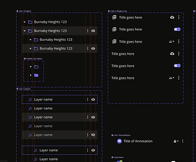
To move efficiently, I used Material Design as a baseline and adapted it to fit our needs. This gave us a reliable starting point without having to test every UI element from scratch, and it helped developers work faster with predictable patterns.
3. Adapting Everything for Unity
Unity added a layer of complexity. Since it uses its own rendering engine, we couldn’t just apply Material like you can with web products. Components needed to be built in a way Unity could handle, which meant custom solutions and close design–developer collaboration.
BEFORE & AFTER
What I Delivered
-
A unified color system across products
-
Core UI components ready for development
-
Defined interaction states (Default, Hover, Selected, etc.)
-
A consistent visual language that worked within Unity’s constraints
The system made prototypes feel more realistic and gave developers clearer direction, reducing back-and-forth and helping new UI features get built faster.
Impact
The new system brought immediate clarity to the UI and made it easier to design and implement new features. Developers no longer had to build everything from scratch, and the product experience became far more consistent across the board.


